Access the world's best jobs
from Frankfurt am Main
 EARN SILICON VALLEY PAY (IN USD)
 FUTURE-READY YOUR ROLE WITH AI
 PROVE WORLD-CLASS SKILLS TO QUALIFY


What We Do
Crossover matches awesome people with awesome jobs.
- We find highly skilled professionals around the world (7 million and counting).
- Empower them to prove world-class aptitude, AI abilities & job skills.
- Enable top tech companies to recruit the best 1% for elite USD full-time jobs.

Recruitment sucks. So we’re fixing it.

The Olympics of work
It’s super hard to qualify—extreme quality standards ensure every single team member is at the top of their game.

Premium pay for premium talent
Over 50% of new hires double or triple their previous pay. Why? Because that’s what the best person in the world is worth.

Shortlist by skills, not bias
We don’t care where you went to school, what color your hair is, or whether we can pronounce your name. Just prove you’ve got the skills.


SPOTLIGHT ON EDUCATION
Lead the future of learning.
Are you ready to lead the next wave of innovation in education? Find high impact roles in teaching, leadership and EdTech on Crossover.
Here you’ll work with visionary schools using AI to usher in the new era of blended education. It’s people and AI, learning together.
- Work from anywhere: Explore fully remote education & EdTech roles
- Lead in person: Find US teaching and education technology roles driving innovation on campus
- Be the change: Help schools set the standard for AI-powered learning in the classroom
Apply now for the best education jobs in the world - where the right minds meet the right moment in education.
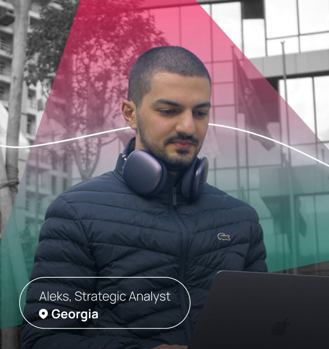
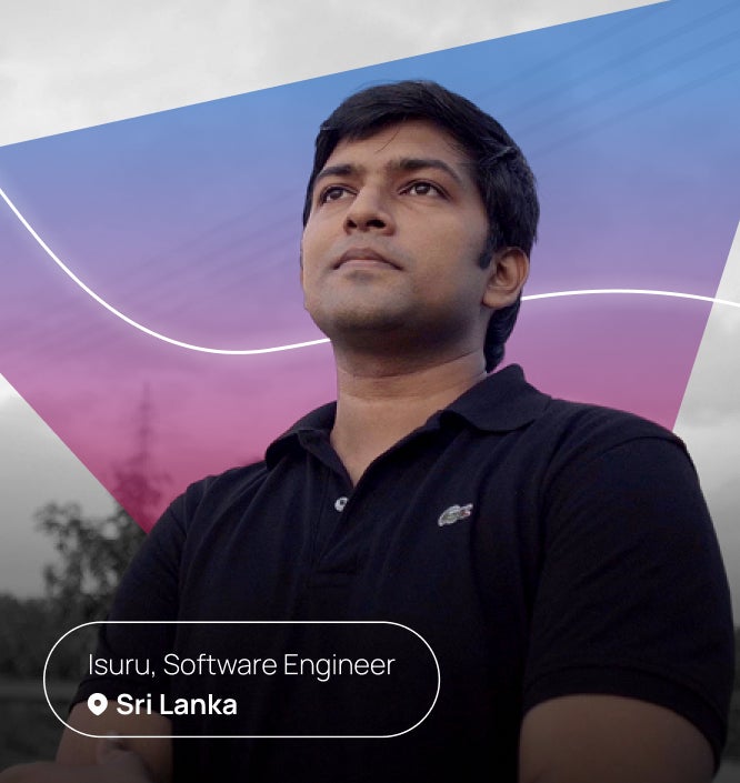
Meet some of the 5,000+ rockstars who have found a rewarding AI-first remote career on Crossover.
Jose | SVP of Software Engineering
What could your career become without bureaucracy in the way? When Brazilian AI leader Jose Monteiro discovered Crossover, he found out. In less than two years, he rose from AI Innovation Manager to SVP of Software Engineering at IgniteTech - reshaping how he ...
Here are a few of the jobs that our clients are currently hiring from Crossover’s talent pool.
Applying for a role? Here’s what to expect.
Crossover's skill assessment process combines innovative AI power with decades of human research, to take the guesswork, human bias, and pointless filters out of recruiting high-performing teams.

Chat-style screening interview.

Cognitive aptitude test.

Prove real-world job skills.

Interview with the hiring manager.

Pass proctored test.

Accept job offer.

From the big picture to the tiny details, everything you need to supercharge your remote career is right here.
Join the Community
Crossover is home to the world's largest digital community of remote workers. Care to join us?
 Latest Edition
 2,389,842 SUBSCRIBERS ON LINKEDIN
News, stories and insights for global remote workers.
- The 11th largest newsletter of any kind on LinkedIn.
- Over 15 million article views, and counting.
 Featured Episode
 SEEN BY OVER 50 MILLION PEOPLE
The most-watched remote work vlog in history.
- Get the latest news on important topics that affect remote workers.
- Meet expert guests and ordinary remote workers from all over the world.
Jobs by Category
 Engineering
 - Engineering Leadership jobs
- Engineering Management jobs
- Product Design jobs
- Quality Assurance jobs
- Salesforce Administrator jobs
- Software Engineer jobs
- AI Developer jobs
- AI Engineer jobs
- Back-end developer jobs
- C# Developer jobs
- C++ developer jobs
- Developer jobs
- DevOps Engineer jobs
- Front-end Developer jobs
- Full Stack Developer jobs
- Java Developer jobs
- Javascript Developer jobs
- PHP Developer jobs
- Python Developer jobs
- React JS Developer jobs
- Ruby on Rails Developer jobs
- Software Developer jobs
 Software Architecture & Design
  Executive Leadership
  Services
  Business & Operations
  Finance
  Product Management
  Sales
Sales  Marketing
  Education
 Join the world's largest community of ![]() AI-first remote workers.
AI-first remote workers.